Showing posts with label Practice. Show all posts

Saturday, 2 April 2016

InDesign: Putting the finished images together


  • Opened MAC folder in InDesign
  • Relinked template image to insert own brand image
  • Selected layers I wanted visible
  • Edited colour, shape and positioning of 'polygon' layer 
  • Opened image of lipstick in Photoshop, cropped white parts from edges, made the shade brighter (hue > select Reds > raised saturation)
  • Relinked layer to insert new brighter lipstick

  • Inserted more pages (some landscape) by creating new 'B master'
  • File > place > selected editorial images to insert
  • File > place > selected mood board and storyboard to insert
  • Resized pages to fit images
  • On last page: inserted text box for evaluation and text box for blog
  • On first page: inserted text box for title and name
  • To save: File > package

Thursday, 31 March 2016

Editing my editorial images

Front:

Camera Raw:
  • Lowered temperature - the original images looked a little too warm to fit with 'penumbra'
  • Cropped image
  • Sharpened image
Photoshop:
  • Clone stamp;
    • removed hairs from forehead or background/blemishes/uneven skin/fallen glitter
    • removed strays from eyebrows and added hairs to fill sparse/uneven parts
    • added shadow of twigs to fill blank patch on cheek
    • evened and rounded shaped of chin
    • neatened lipstick
    • added hair to bunches to make the size match
    • removed glimpse of bottom teeth
    • added glow on nose
    • lessened dark line under lips
    • lightened facial lines/creases around mouth and under eyes
  • Sharpen tool; 
    • sharpened hair to avoid it all blending together
    • sharpen > darker > darkened shadow lines on hair to avoid them blending in
  • Quick select tool;
    • selected yellowy teeth > raised brightness and lowered saturation to whiten teeth
  • Liquify;
    • reshaped brows
    • enlarged lips
    • raised right side of model's head to make it even

Before:

After: 

Profile:

Camera Raw:

  • Cropped image
  • Set the white balance, temperature and tint to the same as the front-facing image
  • Sharpened image
Photoshop:
  • Clone stamp;
    • added shadows of twigs to fill blank space of wall on right
    • removed hairs on face/blemishes
    • added hairs to eyebrows and eyelashes
    • added glitter to eyelids
    • added extra hair to reshape bunches and to cover any visible scalp
    • removed stray hairs from background
    • evened shape of hair on top of head
  • Quick-select tool;
    • selected cheekbone shadow > refine edge > raised feathering > lowered exposure to shade cheekbones
    • selected shadow under lips > raised brightness and lowered contrast to lessen shadow
  • Liquify;
    • reshaped brows
    • enlarged and evened shape of lips

Before:

After:


    Back:

    Camera Raw:
    • Cropped image
    • Set the white balance, temperature and tint to the same as the front and side-facing images
    • Sharpened image
    Photoshop:
    • Clone stamp;
      • neatened parting
      • hid hair elastic
      • added hair to top of bunches
      • removed ring on finger

    Before:

    After:

    These images were harder to edit than my brand one due to the intricate shadows and messy hairs. As I edited, I struggled to make them look realistic at times, and had to go over the same parts more than once to perfect them. However, I enjoyed working on them and am happy with the results. After speaking with my course leader, I understand the importance of things like reducing/enhancing shadows, filling blank spaces, making the hair even and symmetrical, and so on. After putting these tips into use, I think I have created a series of images that are much cleaner and more visually pleasing.

    Monday, 28 March 2016

    Editing my brand image

    Camera Raw:
    • Cropped image
    • Colour picker tool > correct white balance > warmed temperature
    • Sharpen slightly
    Photoshop:
    • Clone stamp;
      • removed hair on ear and on background
      • removed strays on eyebrows and filled in sparse parts
      • added extra lashes
      • removed blemishes, dry skin, fine lines on eye and mouth, scar on chin, lipstick on teeth, faint hairs on cheek, veins on eyeball
      • added shadow to cheekbone
      • filled in the bum in the shadow of her chin
      • smoothed skin on neck
      • evened out shadow on chest and chin
      • neatened lipstick outline
      • removed redness on collarbone
    • Liquify;
      • pushed in square jaw slightly
      • plumped/enlarged lips
    • Quick select tool;
      • selected iris > image > adjustments > changed brightness, hue/saturation, vibrance to change and brighten eye colour
      • selected lower half of iris > raised exposure to make eye 'sparkle'
      • selected teeth > raised brightness to 10 to whiten slightly


    Before: 
    After: 

    I really enjoyed editing this photo, and am really pleased with the finished edit. I have removed all imperfections and made sure to emphasise the lips, as that is the part I want the viewer to focus on. I have also made the eyes much brighter; I think the green hue compliments the bright red lips. Next, I will insert the brand name and any images or designs I wish to include to promote the lipstick. 

    Sunday, 20 March 2016

    MAC shoot - favourite images


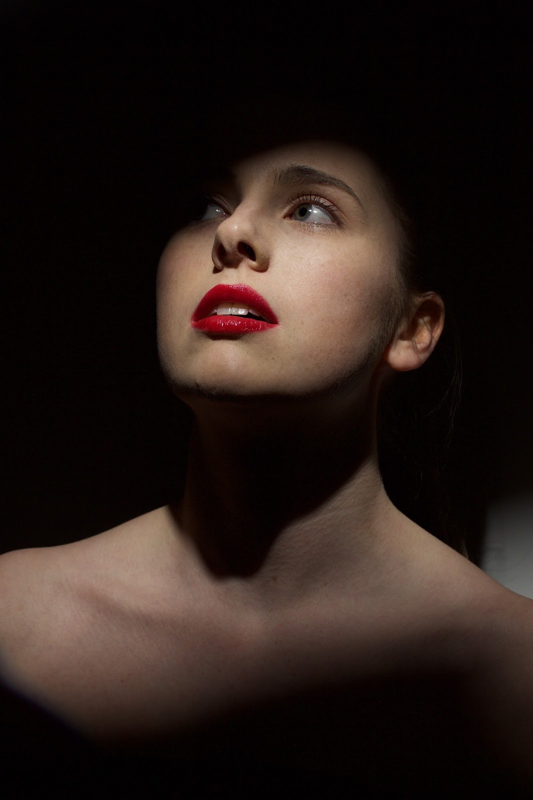
    I really enjoyed this photoshoot. Working with a pose I had already decided on - the tilted head and parted lips - meant there were limited compositions as I could not play around with my model's poses. However, I used a spotlight and had an assistant to help create shadows, in theme with my key word 'penumbra', and also emphasising the bright lipstick, thus promoting my chosen product. Originally I wanted to capture my model's shoulders, however, on reflection, shooting at a closer distance would have been better, as I have decided I want the face to fill more of the frame, so I will have to crop my images - to avoid seeing the reflector disc as well! In post-production, I will be careful to remove any lipstick on the teeth and any wispy hairs, and also soften some of the shadows under my model's chin slightly. My preferred images are the ones where my model is not looking at the camera - I find that avoiding eye contact with the viewer draws more attention to other features rather than the eyes, i.e. the lips and lipstick. I also prefer the shadowy images over the bright ones; however I liked the contrast of the white background in amongst all the shadows. I had considered using a black background, but I really like the monochrome effect. 
    I like the images where the shadows fall upon my model's eyes rather than her lips, as the focus of the pictures needs to be on the lower half of her face, so illuminating this part draws attention to it. My favourite images are the last five - particularly the last one. I think the shadows sit exactly where I want them, outlining the face and especially the lower half, and the pose is how I wanted it to be. However, in post-production, I will need to soften the edges of the shadows slightly as they are a little harsh. I think I prefer the images without the reflector disc being used - I like how the dark shadow surrounds the face, separating it from the body more and making the face the focus of attention. It also reminds me of MAC's Mineralize campaign:


    Thursday, 17 March 2016

    MAC photo shoot call sheet


    Post-production lessons

    1:
    Our first lesson of post-production included revisiting programmes from last semester such as InDesign, Bridge (and Camera Raw) and Photoshop. We were given an example image to work with.

    • Camera Raw:
    • White balance: select the colour picker tool, click on a neutral colour (white/black), the colour balance will automatically set to what it should be. Sliders for hue/saturation, vibrance, etc. can be set to your preferences
    • Sharpening: alt. key + 'masking' shows area of sharpening
    • Select brush tool to add shadow to cheekbones or alter/brighten eye colours 
    • Shift key > open object (in Photoshop)
    • Photoshop:
    • Image > image size > unlink width and height > set width to 97%(ish) to thin face slightly
    • Liquify: (filter > liquify) use Bloat tool to enlarge eyes, use Move tool to make features even - use large circle brush sizes!
    • Window > actions > [menu icon] > load actions > FMS404 > frequency separation > [play button at bottom] > continue, etc > Low frequency + high frequency layers > feather = 20px > filter > blur > gaussian blur
    • Clone stamp tool

    This lesson was a lot to take in after a few months without I.T. lessons! However I was really pleased with how the example image looked once I had applied all the filters and changes that we were showed. I definitely need to play around with the programmes again using my own photos, as there is a lot to remember and apply to my own work. Despite this, I am excited to see how my own images look once I work on them. 


    2: 
    The second lesson of post production was focusing on InDesign a little more. We got shown the templates for our brand images, so I downloaded the MAC one. 

    • InDesign:
    • By going to templates > links > layers, the visible layers were shown, and could be selected or deselected to display the layers that were wanted. For example, various pictures of make-up products, or placement and colour of the brand name. 
    • To insert my own image instead of the example one, file > place > image
    • Set frame to fit content
    • Pages > insert 4 new. This creates the five page document needed for the hand-in. To create landscape pages, right click on 'A-master' > create new master > landscape > drag 'B-master' to where landscape pages are wanted
    • To change the colour of the product to suit the product I am promoting: Select image > edit > edit with Photoshop > adjustments > hue/saturation > change 'master' to 'reds' > slide hue bar
    • To save all: InDesign > links > relink button > select edited image


    3:
    In our third lesson we learnt about typography in InDesign, preparing us for the evaluation page. We learn how to insert columns to make the writing more readable, how to change the font and writing size, how to use 'paragraph styles' to create different bodies of text, how to make sure no text is lost off the page, how to remove hyphens, how to move a title to the centre of the page, and how to widen line spacing. We touched on SWOT analyses, and also inserted a box at the bottom of our page for a hyperlink to our blogs, which we were shown how to create.  

    Monday, 14 March 2016

    Penumbra shoot - favourite images


    In terms of post-production, I will focus on parts of the images that look a little blank - e.g. any wall space where there is no shadow. I will crop the images so that the face and hair fills more of the frame and there is less negative space such as my model's body or the dark area of the wall around the top. I will lower the warmth slightly as I feel a cooler tone will tie in with the darker theme and lighting set-up, and I will subtly lighten any facial lines such as on the chin, cheeks or under the eyes, just to make them less harsh. I will darken any shadow on the hair to avoid them blending and becoming almost unnoticeable, and I will add volume to any parts of the hair that look flat or uneven. I may need to fill in any sections where the scalp shows, as well. The focus of this project is on beauty, and so I want my images to look as 'perfect' as possible. 

    Saturday, 20 February 2016

    MAC brand image - final make-up and hair designs


    I have kept my MAC advertising design similar in theme with my editorial design, as I was really happy with how it represented 'penumbra,' however I have toned it down, tweaked and adjusted it to suit MAC's brand image. I used a red colour on the lips in my design, but I will play around with other colours to decide which one I would like to promote through my final image - although I am certain that it will be a bold colour. Regardless of shade, the rest of the make-up will be as pictured - peachy, natural eyes, fair brows and fairly strong contouring. All of this is in order to keep the focus on the lips: heavy eye make-up would detract focus from the lip product. Also, strong contouring creates a line from the cheekbones down to the mouth, leading the viewer's eye to the lips. It also suits MAC's dramatic, shadowy themes.


    For the hair, I do not want it to be very visible in my image. I also want it to look sleek and professional, suiting MAC's image. Therefore, I have designed a slick, tight, high ponytail, with straight hair at the back. In my hair chart I added a flick at the bottom, however I will shoot my image with a lot of shadow which hides most of my model except for her face, so this will not be seen. 

    I will direct my model to pose with her head tilted back and her lips slightly parted, to emphasise the mouth and further keep the focus on the product being advertised. I will use warm lighting on my model's face, with a bit of lighting at the back to create a subtle glow on the top of the hair, and I will create a lot of shadow on her face, similar to MAC's Mineralize campaign images: